Democracy is sometimes described as “the tyranny of the majority over the minority” (e.g. two wolves and a sheep voting on what’s for dinner), however a more appropriate description might be “the tyranny of the uninformed over the informed.” Georgia’s new license plate is but just one mundane case in support of this secondary meaning.
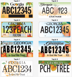
To be fair, it is an attractive design… for a t-shirt. But it’s not going on a t-shirt, it’s going on a moving object and its sole purpose is to rapidly convey information to an observer (e.g. plate number and state). At this it fails miserably. I recently observed a new stationary plate not more than 30 feet away while filling my car with gas and I simply could not make out the number even after staring for some time (yes, my vision is fine). The plate is simply too busy. There is too much color and too many contrasting objects. These design elements while “pretty” do nothing but serve to camouflage the numbers. Sometimes “less is more” (think Apple’s simple package designs vs Microsoft’s “where is Waldo” package designs). Fortunately there is a “plain” tag, although it is not much better due to a dark colored peach in the background obscuring the two central numbers. The only designs that came close to being appropriately designed for the task were tags #1 and #8 and possibly #4.
Georgia is not alone. In the past decade many states have updated their plates to more colorfully busy designs that look great on a magazine cover but are utterly unreadable from more than 6 feet away. This plate beautification trend is symptomatic of a larger dysfunctional political process wherein it is believed that uninformed popular opinion can never be wrong. Rather than choosing politicians who possess the requisite abilities for proper job execution (fiscal discipline, faithfulness to the constitution) we choose them based on superficial qualities (i.e. attractiveness, personality, pandering ability or sometimes whether or not they have a D or R next to their name). The result is a political class that for the most part doesn’t understand what the purpose of government is. Likewise, by employing uninformed popular opinion in its decision making process, government has managed to fumble even the simple task of choosing a plate that succeeds at just one function (legibility) by turning it into a popularity contest that seems more suited to choosing a design for a t-shirt.
And it gets even better. The final design wasn’t even chosen by the people, although it was winnowed down to the top three through a biased on-line voting scheme. The final design was chosen by none other than Governor Nathan Deal. Reminds me of that commercial…”you wouldn’t want your doctor doing your job (cut to doctor playing instrument or running jackhammer), so why are you doing his.” Do you really want your governor acting as an untrained art director, going simply on his gut of what looks “nice” versus actually having someone with training in the field of design who understands the actual task of a license plate: being legible from a distance. Perhaps the governor should decide what books are read in our state run schools based on the cover design?
Having people vote on the final license plate design is not like having them vote on the Peachtree Road Race t-shirt. Rather, it is more like having them vote on which model of police cruiser should be purchased or how thick the asphalt should be on a new road. Hopefully our government buildings won’t someday be engineered by uninformed popular opinion… unfortunately our laws are driven by the same misguided process. Perhaps that explains the mess we are in.

